

 1
1 - beak
- Key Master
 Offline
- From: Qld Australia
- Registered: 24-3-2013
- Posts: 912
Remington Travel-Riter Deluxe review
Mini Review: Remington Travel-Riter Deluxe portable typewriter.
This is my first review, and of my only typewriter of recent years, so be gentle with me! Bought this for the loose change in my pocket five or six years ago and have used it regularly since. Apologies for the dusty and unkempt condition; just been through a week-long typing session with it, and haven’t cleaned it up yet – warts and all this time.
Statistics: 325mm (12.8 “) wide overall / 320mm (12.6”) front to back overall / 110mm (4.3”) tall overall / 5kg exactly.
Line-spacer marked at 1, 1 ½, 2, 2 ½, 3.
Yes it’s portable, but for those used to carrying a lap-top, well, you’ll notice how much heavier this is. Going on a trip away from electricity by car? – fine. Going hiking? – forget it! It’s heavy enough for you to damage your back if you’re not careful about how you lift it off the desk to set it aside. I quickly learned to make sure that the space where I was going to put it was empty first.
Nothing out of the way in terms of where things are or what they do, as far as this novice can tell. I do miss the tab and repeat space functions of my previous machine, which do not appear on this one, but it certainly covers all the basics.
It’s simplicity itself to use, goes in and out of the case easily, and unfolding the return lever and unlocking the carriage (to prevent movement in transit) are both done in a flash. The carriage lock is low down at the back on the right, and I have locked the carriage accidentally more than once when reaching for something on the desk near there – no big deal. I don’t like the paper support bar (single) because you have to hook it out of its holder with a finger nail, and it’s rather tight and awkward to do. It does have the grid-drawing guides, which I’m pleased about – I use these regularly. The guide meant to help you line up a letter under one above (term for this?) is a little too high for ease of use, but this may be so with all machines – don’t know.
Carriage return is really solid-feeling and reassuring – no flimsiness there at all. Warning bell and lock come into play too soon for my liking; you get only three characters after the bell before it locks – perhaps there is an adjuster for this, but I haven’t found it yet if there is (help, please, if you know).
Strong metal frame and casing throughout; it feels solid and dependable. The paint seems to be of very good quality; no chips, wear or discolouration at all, to my eye, on a machine that has been used a very great deal.
The carrying case is fiddle-free and the lock works well. It is solidly made from some leather-like composition (possibly real leather) and has a decent handle. Interestingly, the inside of the case lid has four bold corner marks which fooled me at first – but I guessed eventually that they were indications of the corners of the machine itself; you are invited by them to place the machine on the lid when the case is open and thus have a sloping desk allowing a more comfortable angle. There is some noise-deadening too when used this way; on a hard surface it makes quite a racket.
Would I buy this again if I lost it? – yes, but not if I saw a similar machine with those missing functions I mentioned.
Anything not covered – just ask!


Last edited by beak (08-4-2013 01:26:14)
Sincerely,
beak.
- Shangas
- Speed Champion
Offline
- From: Melbourne, Australia
- Registered: 17-3-2013
- Posts: 298
Re: Remington Travel-Riter Deluxe review
The average on most typewriters is a half-dozen keystrokes (including spacebar) after the bell, before the carriage locks. Perhaps this is a peculiarity to the Remingtons?
Have you tried adjusting the margins? Possibly this is a result of the right margin being too far over.
"Not Yet Published" - My History Blog
"I just sit at a typewriter and curse a bit" - Sir Pelham Grenville "P.G." Wodehouse
"The biggest obstacle to professional writing is the necessity for changing a typewriter ribbon" - Robert Benchley
- beak
- Key Master
Offline
- From: Qld Australia
- Registered: 24-3-2013
- Posts: 912
Re: Remington Travel-Riter Deluxe review
Thanks. Tried that, but it's not the margin set too far. I'll have to get underneath it and have a look to see if I can fiddle anything to cure this. Funny how these little things become a real pain eventually!
Would be interested to learn the date of this machine - tried looking around the web, but with no luck so far.
WOW - the photos make it look much dirtier than it does IRL - next job is a thorough clening!
Last edited by beak (06-4-2013 22:35:44)
Sincerely,
beak.
- •
- Valiant
- Touch Typist
Offline

- From: Toronto
- Registered: 12-3-2013
- Posts: 153
Re: Remington Travel-Riter Deluxe review
beak wrote:
Thanks. Tried that, but it's not the margin set too far. I'll have to get underneath it and have a look to see if I can fiddle anything to cure this. Funny how these little things become a real pain eventually!
Would be interested to learn the date of this machine - tried looking around the web, but with no luck so far.
WOW - the photos make it look much dirtier than it does IRL - next job is a thorough clening!
Your Travel-RIter looks almost identical to my Remington Monarch, which allows exactly seven keystrokes after the bell, wherever the right margin is set. This model is also very similar to my Sperry-Rand Remington Ten Forty, which allows 5 keystrokes after the bell.
"Now is the time for all good men to come to the aid of the typewriter."
- Stevetype33
- Touch Typist
Offline

- From: UK
- Registered: 16-3-2013
- Posts: 172
Re: Remington Travel-Riter Deluxe review
WOW - the photos make it look much dirtier than it does IRL - next job is a thorough clening!
Not to be rude, but that is a pretty grubby old machine you got there (okay, that is a bit rude), but it does have its charm.
What's with the sample type attached to the front of the machine? Is this part of your cataloguing system.
I'm planning on contributing to your typeface thread by the way. I made start this afternoon. Will post soon.
- beak
- Key Master
Offline
- From: Qld Australia
- Registered: 24-3-2013
- Posts: 912
Re: Remington Travel-Riter Deluxe review
....
What's with the sample type attached to the front of the machine? ...
It's just a quick guide to the typeface; in history, I had several machines (and in the future, hope to have again) and this was just a reminder of how their text would look.
Your veiled rebuke is fully justified! The machine does need a good seeing to; I shall do as complete an overhaul as I think I can manage, before long. I want to digest the various manitenace threads and links before I set to with this work.. Shall probably replace pictures when it's done.
Last edited by beak (07-4-2013 20:30:53)
Sincerely,
beak.
- •
- beak
- Key Master
Offline
- From: Qld Australia
- Registered: 24-3-2013
- Posts: 912
Re: Remington Travel-Riter Deluxe review
.
... This model is also very similar to my Sperry-Rand Remington Ten Forty, ....
Yes this one bears the Sperry-Rand logo on the back - I think it's just visible in one of the pix.
Sincerely,
beak.
- •
- beak
- Key Master
Offline
- From: Qld Australia
- Registered: 24-3-2013
- Posts: 912
Re: Remington Travel-Riter Deluxe review
My research so far seems to put this machine slightly earlier than most of the similar examples by Remington dated '1960s' - the lack of any plastic on the casing, for instance. So, tentatively, I'm having a stab at 1950s, untill better reference comes along. Which is earlier than I imagined.
Sincerely,
beak.
- •
- Valiant
- Touch Typist
Offline
- From: Toronto
- Registered: 12-3-2013
- Posts: 153
Re: Remington Travel-Riter Deluxe review
Here's a photo of my Remington Monarch, for comparison. 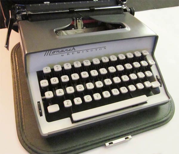
"Now is the time for all good men to come to the aid of the typewriter."
- beak
- Key Master
Offline
- From: Qld Australia
- Registered: 24-3-2013
- Posts: 912
Re: Remington Travel-Riter Deluxe review
Yes the design seems identical - except perhaps that the inset around the keys (white in your example) looks plastic (?) whereas mine is cast aluminium (?). Otherwise, in appearance, it's the same as far as I can tell. The lid of the case comes off (?) in yours to act as a table pad - good idea.
Last edited by beak (11-4-2013 08:21:13)
Sincerely,
beak.
- •
