
 1 of 1
- roller_delawer
- New Member
 Offline
 - Registered: 06-12-2015
- Posts: 6
1935 Underwood Champion. Some keys do not print well.
Hello everyone,
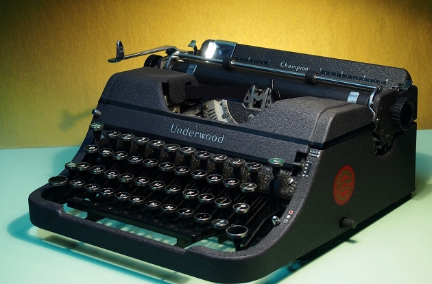
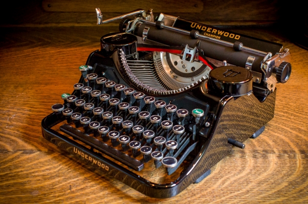
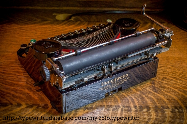
I have recently bought a 1935 Underwood Champion. I found it in a local antique shop. It is in a superb condition, it looks almost new, and all its functions work fine.
After changing the ribbon, cleaning everything and lubricate the mechanism with a non-oily solution (I used graphite powder), it works very nicely.
However, there's one only thing that I want to improve. It is the fact that some letters do not hit the ribbon hard enough, and the mark is not easily readable:
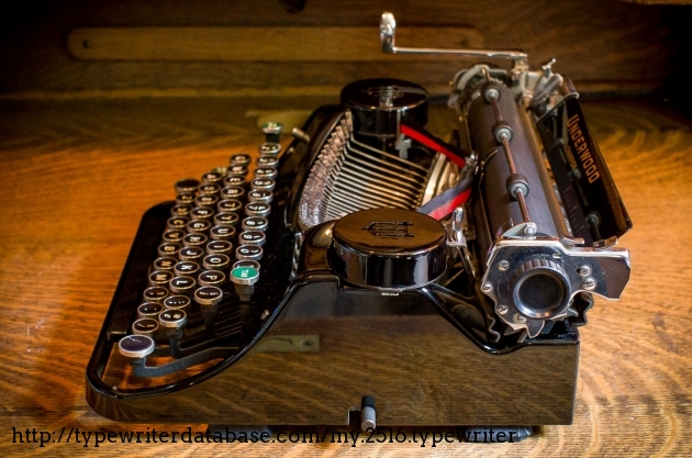
I am completely unfamiliar with this machines, but after studying the problem, I concluded that it is related with this part that I called "type stopper". I am am talking about this area/piece where the metal type touch the segment and stop its movement (black semicircle in my machine)
As you can see in the photo, there are some areas more worn than others. Is precisely in these areas where the letter with best print can be founded. For example: in the bottom area, a bit in the left you can find a very worn area, this zone is where the letter "d" and "e" stops.These two letters write very well.
My conclusion is, if I sandpaper the complete semicircle to reduce its thickness some microns and even the whole surface, I will achieve an optimal typing.
What do you think??
Thank you!
Regards
- TypewriterGuy
- Typewriter Talk Vet
Offline
- From: United States
- Registered: 24-4-2015
- Posts: 1,250
Re: 1935 Underwood Champion. Some keys do not print well.
I would not sand that. If it worked then, then it should work now. i think that your problem may be that you are not hitting the keys hard enough. Try hitting them harder. Also, is the platen really hard and non grippy? It may have shrunk. AND I think that some keys may be out of alignment.
Back from a long break.
Starting fresh with my favorite typer. A Royal Futura!
- Uwe
- Moderator
Offline

- From: Toronto, Canada
- Registered: 12-3-2013
- Posts: 4,410
Re: 1935 Underwood Champion. Some keys do not print well.
roller_delawer wrote:
...some letters do not hit the ribbon hard enough, and the mark is not easily readable... I concluded that it is related with this part that I called "type stopper". My conclusion is, if I sandpaper the complete semicircle to reduce its thickness some microns and even the whole surface, I will achieve an optimal typing.
Your "type stopper" is called the ring. Some machines have adjustable rings, others do not, but it is ring and cylinder adjustments that factor into type quality.
First off, I'd strongly advise against sanding the ring down at this point. Typewriters are machines that you make small, incremental adjustments to, and something as altering the thickness of the ring is a fairly drastic measure.
Looking at your type sample, it appears that the uppercase letters are printing too low. This is very obvious when you look at the line that you've typed with the letter m. The first thing I would do is work on the vertical alignment to make sure that all the characters are on the same baseline. This adjustment alone can have a profound effect on the overall type quality. Vertical alignment is achieved by adjusting the carriage travel when the shift key is pressed.
Remember, type slugs are not flat, they are slightly curved and have to be correctly aligned so that their curvature perfectly mates with that of the platen. Too high, or too low, and you will get an uneven impression. Once the type is aligned you can revisit the problematic characters. The ring serves to stop the slug just short of the paper. If you manually lift a typebar up until it makes contact with the ring, there should be the thinnest of gaps between the surface of the slug's character and the paper. If the ring is set too far you won't get an impression at all, if it's set too deeply you would get a blotchy character on the page. The exact gap can be measured with a feeler gauge, but the correct distance (or range) can vary from model to model, so I would use a slug that is making a perfect impression as a benchmark. Use that distance and compare it to the problem slugs. And keep in mind that the typebar itself could be bent, so compare the positioning of good slugs to the bad ones. Sometimes just a subtle straightening of a typebar can be the solution to such a problem.
I'm assuming that if your ring was worn you would have very dark characters because some letters would be striking the page too hard, and I don't see any evidence of that in your type sample, which is one reason why I think it would be a huge mistake to alter it in any way. Remember, if you make the ring thinner, you would have to adjust the cylinder (platen) too otherwise your slugs will end up shredding the ribbon and destroying the platen's rubber. Good luck.
The pronoun I has always been capitalized in the English language for more than 700 years.
- roller_delawer
- New Member
Offline
- Registered: 06-12-2015
- Posts: 6
Re: 1935 Underwood Champion. Some keys do not print well.
Thank you very much for all your useful advices ![]()
I would not sand that. If it worked then, then it should work now. i think that your problem may be that you are not hitting the keys hard enough. Try hitting them harder. Also, is the platen really hard and non grippy? It may have shrunk. AND I think that some keys may be out of alignment.
Hello TypewritterGuy. I am sure the I am hitting the keys hard enough, in fact, there is a point for every type where it doesn't matter how hard I hit the key, the impression does not improve. Take a look, for example at letter "v" in the words "every" and "conservation", with respect to the sample line "vvvvv". The first time I was hitting the key with a medium force, in the sample line, I was pressing it very hard.
With respect to the platen. It is grippy enough to "catch" the paper when I roll it. I don't know if that should be enough... how can I know its optimal hardness point?? I mean, how cna I test it??.
The first thing I would do is work on the vertical alignment to make sure that all the characters are on the same baseline. This adjustment alone can have a profound effect on the overall type quality. Vertical alignment is achieved by adjusting the carriage travel when the shift key is pressed.
[...]
I'm assuming that if your ring was worn you would have very dark characters because some letters would be striking the page too hard, and I don't see any evidence of that in your type sample, which is one reason why I think it would be a huge mistake to alter it in any way. Remember, if you make the ring thinner, you would have to adjust the cylinder (platen) too otherwise your slugs will end up shredding the ribbon and destroying the platen's rubber. Good luck.
Hello Uwe, thank you very much for the vocabulary lesson.
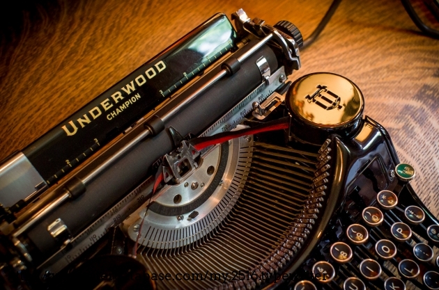
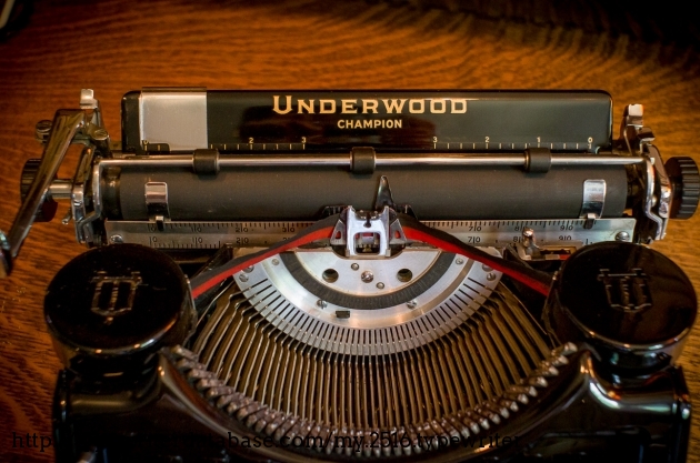
Your advice seems much clever than my crazy idea. I have no idea how the heck I can adjust the alignment. Could you please try to give me any kind of tip? (Meanwhile I will try to find by myself) I give you some pics showing a machine exactly like mine:
Pic 1
Pic 2
Pic 3
Pic 4
Pic 5
Pic 6
In any case, my main concern is that if I adjust the machine to the point where I solve the problem with the types that print lightly, I will create a problem with the types that print well right now. In the photo of the first message, yuo might not see clearly, but the difference in the thickness of the ring is quite big ( I would say almost 1mm in the worst case).
- •
- roller_delawer
- New Member
Offline
- Registered: 06-12-2015
- Posts: 6
Re: 1935 Underwood Champion. Some keys do not print well.
Just to compare...
Distance to platen:
Letter "v"
Letter "o" (actually touch the platen)
- •
- Uwe
- Moderator
Offline
- From: Toronto, Canada
- Registered: 12-3-2013
- Posts: 4,410
Re: 1935 Underwood Champion. Some keys do not print well.
I'm familiar with your typewriter. I have a number of Underwood portables from the same era including the Universal version of your machine, and a Champion with the Sealed Action Frame that replaced your model.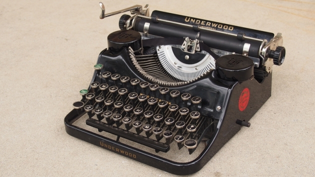
None of my machines have a ring that looks like yours, which also appears to be missing the small cover under the type guide. It's difficult to tell from your photo, but is the ring on your machine a separate piece that is attached to the segment as opposed to it being a part of the segment as on my machines (see photo below)?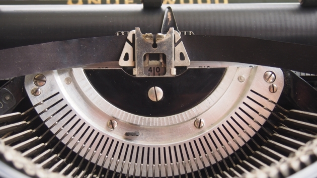
Something else: take a look at your photo of the v and o typebars. If you look at the backside of the each typebar you can see the flattened edge, which is caused by slamming other typebars into to. This happens when the typebars jam, but if the typewriter was abused (like when a child pounds on the keys) it can also cause the typebars to bend out of shape. Given what I see in your photos, it's something else for you to check.
Again, I wouldn't touch the ring until I was absolutely positive that all of the typebars and slugs were perfectly straight relative to each other, and the upper and lowercase type had been correctly aligned.
The pronoun I has always been capitalized in the English language for more than 700 years.
- TypewriterGuy
- Typewriter Talk Vet
Offline
- From: United States
- Registered: 24-4-2015
- Posts: 1,250
Re: 1935 Underwood Champion. Some keys do not print well.
Id follow Uwes suggestion and just try adjusting the alignment first.
Back from a long break.
Starting fresh with my favorite typer. A Royal Futura!
- TypewriterGuy
- Typewriter Talk Vet
Offline
- From: United States
- Registered: 24-4-2015
- Posts: 1,250
Re: 1935 Underwood Champion. Some keys do not print well.
Oh, just read the rest now. Your problem might be dirt in the type bar slot, AND/OR alignment. Try getting a thin wooden toothpick, or if you can, a bobby pin with the plastic stuff on the end works well too. Scrap in INSIDE the slot, and try and see if you can get any dirt out, if you can.
Back from a long break.
Starting fresh with my favorite typer. A Royal Futura!
- roller_delawer
- New Member
Offline
- Registered: 06-12-2015
- Posts: 6
Re: 1935 Underwood Champion. Some keys do not print well.
Hello again guys,
Sorry for the delay in the answer, and thank you again for your comments.
I have tried again to carefully clean the segment, I have also lubricated the mechanism with a non-oily-Teflon-based solution, and I have bought another new ribbon.
The problem has been reduced for some keys, but it still persists. And after an extensive search, I haven't found the way to adjust the alignment.
Answering to your questions, Uwe, Yes, the ring seems to be a separate piece. And I am not quite sure if there was any kind of cover under the type guide... There is no thread without screw or something like that.
Could you help me with the alignment issue? Thank you very much!
- •
- TypewriterGuy
- Typewriter Talk Vet
Offline
- From: United States
- Registered: 24-4-2015
- Posts: 1,250
Re: 1935 Underwood Champion. Some keys do not print well.
Then as Uwe said, its the type bars. Im not going to tell you exactly what to do, because Im not sure, but you are going to have to carefully bend the slugs forward (I think).
Back from a long break.
Starting fresh with my favorite typer. A Royal Futura!
