- Jack Kerouac
- Novice Typer
 Offline
 - From: Sydney, Australia
- Registered: 06-2-2019
- Posts: 38
Re: Recent Acquisitions Thread
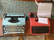
Does anybody know how many colours the Lettera 22 was available in when new? There are a number of variations and it’s hard to tell from online photos if the differences in greens and blues in particular are due to fading with age and lighting.
So far, I’ve seen:
- fawn
- green, from olive green to pistachio (sometimes yellower, almost lime green)
- blue, from baby blue through to a deeper grey blue
- salmon pink
- thetypewriterman
- Key Master
 Offline
 - From: Leiston, England
- Registered: 29-5-2013
- Posts: 946
Re: Recent Acquisitions Thread
Re: Differences between small Olympias. The SF and SF Deluxe are pretty well the same machine under the skin. The Traveller was developed from them and has a few differences. The cast frame is a lot different but many of theother mechanical parts (I would guess about 90%) are the same. When the Traveller became a cheaper mass-market machine here in the 1980's (sold through normal retailers and no longer exclusively through Olympia typewriter dealers), the quality began to slip a little. However, it was still head and shoulders above other makes right to the end.
- Jack Kerouac
- Novice Typer
 Offline
 - From: Sydney, Australia
- Registered: 06-2-2019
- Posts: 38
Re: Recent Acquisitions Thread
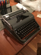
Another new arrival...
I found this 1956 Olympia SM3 for a reasonable price, and had it shipped. The seller said it was functionally sound. It appeared to be packed well, but there’s an issue. The carriage makes a sound like the teeth of the gear rubbing as it’s moved. When the caps lock is on, the grinding isn’t there and the carriage is quite smooth. The carriage moves as it should when typing. Any help would be appreciated.
I should put this in the repairs section.
In any case, she is pretty.
- Jack Kerouac
- Novice Typer
 Offline
 - From: Sydney, Australia
- Registered: 06-2-2019
- Posts: 38
Re: Recent Acquisitions Thread
Is this the solution to my ne SM3’s ills?
- M. Höhne
- Key Master
 Offline
 - From: Maine
- Registered: 14-3-2013
- Posts: 648
Re: Recent Acquisitions Thread
Jack Kerouac wrote:
Is this the solution to my ne SM3’s ills?
Yes, i tis. Why would you doubt it? Kudos for finding this fix on your own. You have a great typewriter there. Have Fun!
- Fragpie
- Novice Typer
 Offline
 - Registered: 21-9-2018
- Posts: 32
Re: Recent Acquisitions Thread
I finally found a decent Olivetti Studio 44 today, to round out the collection. Amazingly, its platen feels nearly new, and I suspect that this machine was barely used. I am sad (if not surprised) to report however, that yep-- mushy type action. Not bad, mind you, but nowhere near as nice as a 5-Series SC, for instance. It's like there's a mini marshmallow to cushion the last 10% of each keystroke, and it feels very unsatisfying to me. The typeface is darn straight, though, and beautiful to boot.
The tower grows taller...
- Uwe
- Moderator
 Offline
- From: Toronto, Canada
- Registered: 12-3-2013
- Posts: 4,410
Re: Recent Acquisitions Thread
I buy Olivetti machines for their aesthetic design, but use machines from other manufacturers to actually type with. ![]()
The pronoun I has always been capitalized in the English language for more than 700 years.
- •
- Fragpie
- Novice Typer
 Offline
 - Registered: 21-9-2018
- Posts: 32
Re: Recent Acquisitions Thread
I found this somewhere online, and although it doesn't make me dig the Olivetti type action, it does make me appreciate it as a valid alternative; as an alternate whole aesthetic:
When you strike a key, there’s a measured pace to the typebar. According to Olivetti, “the typebar movement is based on the principle of progressive acceleration.” Somehow it almost doesn’t feel mechanical, but more like an extension of your fingers. Other typewriters feel like they’re translating your energy to levers and joints and springs. You’re working the machine. Not so with the Studio 44, which has a softness to it, and seems to mute the actual mechanicals at work. After typing for awhile, you have the sensation that inside this machine are tendons and muscles and bone. There’s an addicting quality and a bond begins to form between human and machine. Isn’t that the goal of any artist’s tool, that it becomes one with it’s user?
Almost Cyborg, with the reference to tendons, etc... Like keep a "typing flesh golem" in one's office to take dictation!
- Fleetwing
- Typewriter Talk Vet
 Offline
 - From: Hartford, CT USA
- Registered: 30-6-2015
- Posts: 1,022
Re: Recent Acquisitions Thread
I had a Studio 44 and sold it -- it really felt like it took too much effort to type, and I couldn't get consistent printing as a result. Later I got a Lettera 22, because it's regarded as a classic. I have to say that the typing feel is much nicer -- there is some of the "cushioning" effect, but I found that I liked the feel very much. Could be just my two examples, but my experiences seem consistent with what others have said.


