- Pete E.
- Typewriter Talk Elite
 Offline
- From: Idaho - USA
- Registered: 23-6-2020
- Posts: 2,537
Re: 1967 Facet Tippa Italic, like new.
Hi Jim,
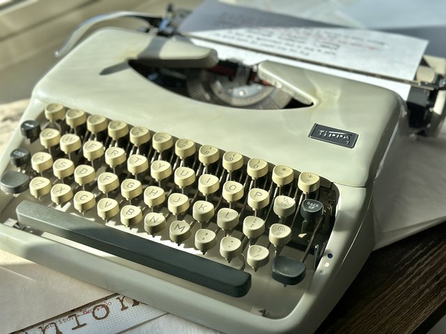
Congratulations on the Tippa ! Any sort of italics machine is a pursuit of mine...
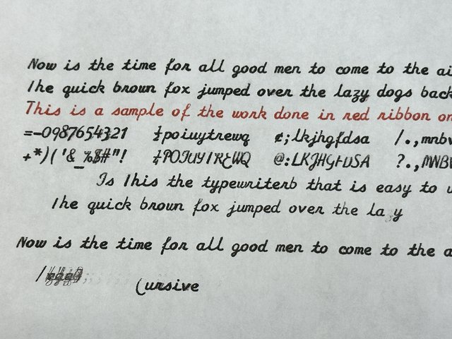
When you have time, could you post-up a print-out of the script ? I would like to see the style used,
BTW...small point of clarification...but these Tippas were made by Adler and issued as a re-badged "Triumph" as well.
Not sure Facit had a hand with them.
.
- Kalani
- Touch Typist
 Offline
- From: Fountain Pen Network profile
- Registered: 26-8-2021
- Posts: 169
- •
- Pete E.
- Typewriter Talk Elite
 Offline
- From: Idaho - USA
- Registered: 23-6-2020
- Posts: 2,537
Re: 1967 Facet Tippa Italic, like new.
I like the Italics that Olympia used.
Here is a sample of that on a Splendid 66 sold in the UK in the past. It is really easy on the eyes.
Toronto Typewriter has 1-2 Italics machines for sale but $ 750 CAD and more. Way, way too rich for my blood.
.
- Kalani
- Touch Typist
 Offline
- From: Fountain Pen Network profile
- Registered: 26-8-2021
- Posts: 169
Re: 1967 Facet Tippa Italic, like new.
Good point.
I never thought about that.
Yes. Some Italic machines that I have are tough to read so I tend not to use them.
Which ones are easy to read?
- •
- Pete E.
- Typewriter Talk Elite
 Offline
- From: Idaho - USA
- Registered: 23-6-2020
- Posts: 2,537
Re: 1967 Facet Tippa Italic, like new.
Hi Jim,
The machine you posted in the opening-post has a Cursive script...and not an Italics script.
Cursive script has miost of the adjacent letters mostly touching each other...to simulate long-hand penmanship.
Italics script does lean to the right...but the adjacent letters do not touch each other.
That little space between italics letters, I think for me, make them easier and more pleasant to read on paper.
I have no italics machines and now have 5 cursive machines.
I like the cursive script on my Yugoslavia-made Olympia Traveller the most out of my bunch. The upper-cases on this machine are more simple and not so "fanciful" as they are on the other 4 machines I own. (See sample, below...)
.
- fountainpensplus
- Touch Typist
 Offline
 - From: Eugene, OR, USA
- Registered: 11-10-2021
- Posts: 153
Re: 1967 Facet Tippa Italic, like new.
Pete E. wrote:
I like the Italics that Olympia used.
Here is a sample of that on a Splendid 66 sold in the UK in the past. It is really easy on the eyes.
Toronto Typewriter has 1-2 Italics machines for sale but $ 750 CAD and more. Way, way too rich for my blood.
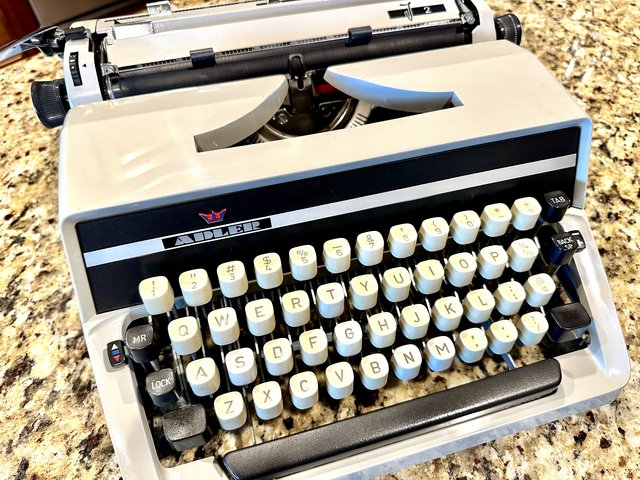
Hi Pete, I recently acquired an SM3 with that same typeface from Anthony at Type Space in Portland. At a much, much better price than that. It is easier to read than the cursive script but I think the cursive gives a different feel to a letter. I wouldn't use it for anything other than a personal letter. The italic could be used for anything I think.
George
- fountainpensplus
- Touch Typist
 Offline
 - From: Eugene, OR, USA
- Registered: 11-10-2021
- Posts: 153
Re: 1967 Facet Tippa Italic, like new.
Hi Jimmy,
The new machine looks very nice! The cursive script appears pretty crisp and joins the letters well. I wonder if it's a smaller typeface than the Olympia I sent you in a letter. I notice the Tippa has a red/black ribbon and three settings. My Monica and SM3 with a similar typeface has only two settings due to the larger size.
George
- Pete E.
- Typewriter Talk Elite
 Offline
- From: Idaho - USA
- Registered: 23-6-2020
- Posts: 2,537
Re: 1967 Facet Tippa Italic, like new.
Hi George,
Congratulations on acquiring the SM3, in 2-tone, with Italics.
One day I hope to score one at a reasonable price.
You and LaDonna are quite the tag-team when it comes to finding such jewels...
.
- Kalani
- Touch Typist
 Offline
- From: Fountain Pen Network profile
- Registered: 26-8-2021
- Posts: 169
Re: 1967 Facet Tippa Italic, like new.
- •

 1
1 


