

- Repartee
- Key Master
 Offline
- From: Brooklyn
- Registered: 12-10-2015
- Posts: 683
Re: SG Owners Club
Uwe wrote:
Its proper name is Double Gothic #30 and it's not a radio mill typeface. An Olympia typeface that would be more appropriate for telegraph or radio mill use would be the 10-pitch Capitals #95. If there's one typeface I'd love to have installed on an SG1 it would be the 17-pitch Manuscript, but I certainly won't be holding my breath expecting to ever find one.
Uwe, how can you find a typeface called Double Gothic #30 vulgar! What a wonderful name - I am motivated to type pages and pages in it! What typeface do you prefer? Me? I use Double Gothic #30, and I drink Teachers.
Besides misnaming this typeface my post contained an outright error which I caught later. I said the Senatorial #71 machine was 11 CPI, which it is, and that the smaller Courier-like font was 12 CPI. But this was based on the fact that it was obviously smaller, though when I happened to measure it it was 11 characters and 6 lines per inch, just like the Senatorial! This had me completely stumped until I realized that the straight sided Senatorial typeface enclosed more space in its closed characters. It is "larger" in this limited sense but the perceptual illusion is strong that it is actually fewer characters or lines per inch. This typeface increases readability and makes itself look larger while putting just the same information into a given surface area on the page.
Very clever, Mr. Bond. And in fact, it is clever enough. You are free to go.
"Damn the torpedoes! Four bells, Captain Drayton".
- Uwe
- Moderator
Offline

- From: Toronto, Canada
- Registered: 12-3-2013
- Posts: 4,410
Re: SG Owners Club
Uwe, how can you find a typeface called Double Gothic #30 vulgar! What a wonderful name - I am motivated to type pages and pages in it!
Ha! Double Gothic is a double mocha frappadapachino. Nope, just plain old Gothic is enough goth for me. Okay, so the double actually refers to there being the same Gothic typeface in two sizes using the upper and lowercase, but in practical use I think it's vulgar to mix the two, and double vulgar when a full page of it is staring at you. Try it out and you tell me. Would you want to read a ten page article in that typeface? Not me. No way.
I'm of the mindset that you use the right typeface for the right job. Have a form to fill out, something that has minimum requirements for type? In that case I can see using the Gothic typeface and it would look quite cool. But when I want to fill a blank sheet with type it's all about easy-peasy legibility, which is something Gothic does not do. IT'S ACTUALLY HARDER TO READ ALL CAPS, AND BESIDES, EVERYONE KNOWS IT'S POOR FORM TO ONLY TYPE IN UPPERCASE, EVEN ON THE INTERNET WHERE GOOD MANNERS ARE RARELY FOUND IT'S CONSIDERED TO BE THE EQUIVALENT OF SHOUTING.
The pronoun I has always been capitalized in the English language for more than 700 years.
- •
- Repartee
- Key Master
Offline
- From: Brooklyn
- Registered: 12-10-2015
- Posts: 683
Re: SG Owners Club
Today was repair day for the Double Mocha Frappadapachino.
When I received it, it was not pretty...
I eventually managed to beat it into workable condition
Then it was time to free the typebars, half of which fell back in slow motion. I know how to do that! I apply solvent to the segment! I have over six months of experience. Woohoo!
Unfortunately this did not work, and ever greater quantities of mineral spirits and a warmed automotive fluid which seem likely to dissolve things out of pure meanness had no effect at all. Finally the still small voice which we ignore while we are headed in the wrong direction managed to put in "Maybe it's not stuck at the segment but some other part of the linkage". The only other pivot point I saw in the linkages was directly under where the slugs sit at rest... sure enough a little solvent freed there everything immediately.
Now for the typeface. I have to admit a long line of what should be lowercase text typed in tiny capital letters gives immediate eyestrain. ![]() Capitalizing every word is an improvement, though not exactly the way you would like to use a typewriter...
Capitalizing every word is an improvement, though not exactly the way you would like to use a typewriter...
![]()
So I guess that makes owning this relatively huge machine with lack of practical use worth it, right?
I noticed something while manipulating the logo photo. Blow it up a bit more, and...


"Damn the torpedoes! Four bells, Captain Drayton".
- Repartee
- Key Master
Offline
- From: Brooklyn
- Registered: 12-10-2015
- Posts: 683
Re: SG Owners Club
... EVEN ON THE INTERNET WHERE GOOD MANNERS ARE RARELY FOUND IT'S CONSIDERED TO BE THE EQUIVALENT OF SHOUTING.
![]()

"Damn the torpedoes! Four bells, Captain Drayton".
- Ampelmann
- Platen Punisher
Offline
- Registered: 20-3-2016
- Posts: 66
Re: SG Owners Club
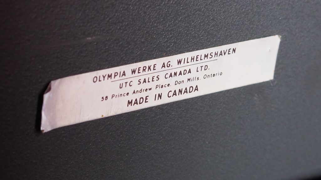
So, I have a question for anyone who wants to take a stab at it. Last week I scored in the thrifts and found myself an SG3 for $30 - it was in good mechanical shape once I evicted the dust bunnies from their nest, and has everything present and accounted for except the paper rest. The left hand platen knob, however, kept sliding around preventing the return lever from advancing down to the next line - a single strategically-placed elastic band solved the problem though!![]()
What I found most interesting though, was that the placard on the back of the machine said 'Made in Canada'. I know SG3s were made in Germany and Mexico - I didn't realize they were also produced domestically. So, my question is, does anyone know anything about Olympia typewriter production in Canada? I'd be curious to know!
FYI, the serial number, according to the Typewriter Database, places the year of production to 1967.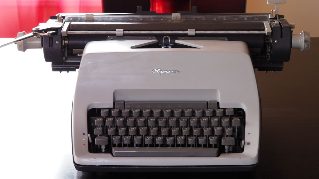
- Uwe
- Moderator
Offline
- From: Toronto, Canada
- Registered: 12-3-2013
- Posts: 4,410
Re: SG Owners Club
Could you post the serial number?
I have a few Olympia models with the Made in Canada label, and although I'm still working on proof of it, my theory is that it was only final assembly that was performed here, perhaps to get around something like import taxes or other for other financial reasons.
The pronoun I has always been capitalized in the English language for more than 700 years.
- •
- JustAnotherGuy
- Speed Champion
Offline

- From: Illinois, USA
- Registered: 20-9-2014
- Posts: 277
Re: SG Owners Club
As it would happen, I now have four SGs. Two SG3s, and now, two SG1s. The newest SG1 continues my luck with intact paper rests - haven't gotten a broken one yet! - and types in a very very small (I believe it's called "micro elite") typeface.
Here are some pictures of my new acquisition:
 I've still got plenty of cleaning to do, but with a little work it should type great.
- Uwe
- Moderator
Offline
- From: Toronto, Canada
- Registered: 12-3-2013
- Posts: 4,410
Re: SG Owners Club
...my luck with intact paper rests - haven't gotten a broken one yet! - and types in a very very small (I believe it's called "micro elite") typeface.
The problem with the paper rests isn't that they're found broken (I could deal with that), it's that they're often completely missing. I'm not sure why that's the case, but given that the paper rest detaches from the machine very easily might have something to do with it. Somewhere in the world there's a back alley market of black market items, and in it an old man smoking a hookah in a corner stall who has behind him a mountain of SG paper rests alongside Russian nuclear warheads and crates of RPG ammunition.
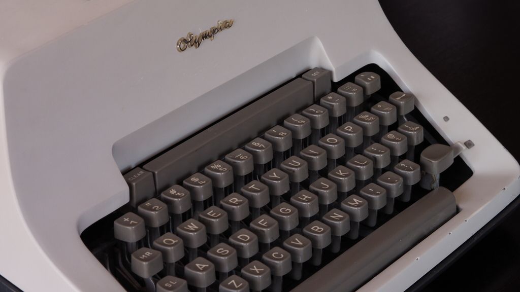
Can you check your type slugs and give us the two digit number that's on them?
The pronoun I has always been capitalized in the English language for more than 700 years.
- •
- JustAnotherGuy
- Speed Champion
Offline
- From: Illinois, USA
- Registered: 20-9-2014
- Posts: 277
Re: SG Owners Club
]Can you check your type slugs and give us the two digit number that's on them?
Most say only 7.6 (also inscribed on the basket, so I assume it's not the number you want), but one says (I think) 87 and 7.6.
- Uwe
- Moderator
Offline
- From: Toronto, Canada
- Registered: 12-3-2013
- Posts: 4,410
Re: SG Owners Club
Yeah, 7,6 is for the motion, and not what I was after. However, 87 is for the standard Olympia elite typeface. There's nothing micro about it, it just looks smaller because it's a European-sized elite. Thanks for looking.
The pronoun I has always been capitalized in the English language for more than 700 years.
- •
