- Jack Kerouac
- Novice Typer
 Offline
 - From: Sydney, Australia
- Registered: 06-2-2019
- Posts: 38
Re: Recent Acquisitions Thread
- Jack Kerouac
- Novice Typer
 Offline
 - From: Sydney, Australia
- Registered: 06-2-2019
- Posts: 38
Re: Recent Acquisitions Thread
This is the Italic Elite Of The 1967 SF
<a href='' target='_blank'><img src='' border='0' alt='71-BEA97-E-4362-460-D-9599-24-E5-E3317-BEC'/></a>
- Jack Kerouac
- Novice Typer
 Offline
 - From: Sydney, Australia
- Registered: 06-2-2019
- Posts: 38
Re: Recent Acquisitions Thread
Some time between 1962 and 1967, the length of the return arm changed...
Also, the rubber grommets that secure the lid on the 1962 were perished, while the grommets on the 1967 are perfect.
<a href='' target='_blank'><img src='' border='0' alt='B1629-B7-D-B249-4573-8430-0-A85603-BD4-AB'/></a>
- M. Höhne
- Key Master
 Offline
 - From: Maine
- Registered: 14-3-2013
- Posts: 651
Re: Recent Acquisitions Thread
tldr; Pica and elite are not typefaces; they are pitches, 10 and 12 characters per inch, respectively
Just a reminder, which has to be made periodically:
Pica and elite are not typefaces; they are pitches, 10 and 12 characters per inch, respectively. Those two terms tell us nothing about the design or shape of the characters (which is what "typeface" means) but only the spacing of characters along the typing line. I mention this in the interests of clear communication among all the people in the typewriter field.
If you want to tell the design of the characters, the typeface or even just the font, then the major descriptions are: roman (having serifs), sans serif (also called "gothic' - not having serifs), italic (slanted to the right and if you want to indicate, also add "serif" or "sans serif", as the case may be), script which is often mistakenly called "cursive" (which is properly reserved for handwriting), and a distinctively straight-lined one variously called square, robotic, computer, and a couple of other names I can't remember. Any of these can occur on either pica or elite typewriters.
These terms do not definitely describe the typeface, however; just the category of the typeface. Almost every typeface has a definite name designating its exact design and these names can vary from manufacturer and most people won't care about that level of detail.
Finally, no one has ever taught me how these terms and others for pitch are handled in Europe. Does anyone here know? Asian typewriters seem to follow American practice.
Whew! That one got away from me, eh?
- Jack Kerouac
- Novice Typer
 Offline
 - From: Sydney, Australia
- Registered: 06-2-2019
- Posts: 38
Re: Recent Acquisitions Thread
It would seem that Olympia used Pica and Elite as typeface names and not just as a reference to their pitch. The 1962 SF is Pica No.12 (10 pitch), and the 1967 SF is Italic Elite No.89 (11 pitch).
- M. Höhne
- Key Master
 Offline
 - From: Maine
- Registered: 14-3-2013
- Posts: 651
Re: Recent Acquisitions Thread
Jack Kerouac wrote:
It would seem that Olympia used Pica and Elite as typeface names and not just as a reference to their pitch. The 1962 SF is Pica No.12 (10 pitch), and the 1967 SF is Italic Elite No.89 (11 pitch).
Oh, yes, many companies used the words pica and elite in the names of their typefaces but that did not define the terms pica and elite nor was it useful in distinguishing the type design; that was mostly because those were familiar names to the public, the way we use "mega" today. They were almost always used in conjunction with other terms, like "No. 12", to make a distinct name for a distinct typeface. I submit that Olympia was not using the terms as a reference to more than their pitch; they used the whole phrase "Italic Elite No. 89" to designate that typeface. Furthermore, if they used "Italic Elite No. 89" they probably also had a "Italic Pica No. xx" (which you have not encountered yet) and in that case they did use the terms to designate pitch. If they used only the term pica, they used it wrong. (Did a marketing team ever do anything wrong?)
Note that a great many people use pica indiscriminately to refer to the roman (vertical, serif design), so then what are we to make of "Pica Italic"?
And remember that I said that I do not know how the Europeans handled pitch terms. If they are making up usage for the American market, well.... Could be that Olympia thinks of "elite" as "tighter than pica" for English speakers.
My only point here is that the terms "elite" and "pica" are only useful in the U.S. and possibly Great Britain and Asia for designating the pitch of the characters in the line; any other use non-informative and risks confusion. A lot of newbies, especially on reddit, apologize for not knowing the correct terms for things. They recognize that standard terminology is useful and they wish they knew it. So here I am trying to clarify things.
- Uwe
- Moderator
 Offline
- From: Toronto, Canada
- Registered: 12-3-2013
- Posts: 4,410
Re: Recent Acquisitions Thread
Jack Kerouac wrote:
Here are my two most recent finds. I spent today working on them.
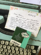
- The first is a 1962 Olympia SF in a lovely aqua blue/green that my daughter has claimed. It has a Pica typeface.
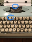
- The second is another SF from 1967 with the italic elite typeface
Beautiful machines, congratulations. However, it's important (maybe just to me?) to specify that they're examples of the SF De Luxe because the De Luxe case design is significantly different to that of the original SF.
I'm not going near the typeface discussion (Michael is the resident expert). ![]() When I meet up with local collectors we often can't even get past debating the meanings of the words 'typeface' and 'font' when it comes to discussing typewriters.
When I meet up with local collectors we often can't even get past debating the meanings of the words 'typeface' and 'font' when it comes to discussing typewriters.
The pronoun I has always been capitalized in the English language for more than 700 years.
- •
- Jack Kerouac
- Novice Typer
 Offline
 - From: Sydney, Australia
- Registered: 06-2-2019
- Posts: 38
Re: Recent Acquisitions Thread
Were there any significant changes other than the outer body from the SF, to the SF De Luxe, and then the Traveller? To add to the confusion, were the Splendid models essentially the same as the first SF?
- Jack Kerouac
- Novice Typer
 Offline
 - From: Sydney, Australia
- Registered: 06-2-2019
- Posts: 38
Re: Recent Acquisitions Thread
- Jack Kerouac
- Novice Typer
 Offline
 - From: Sydney, Australia
- Registered: 06-2-2019
- Posts: 38


