
 1 2 Jump to
- Kalani
- Touch Typist
 Offline
- From: Fountain Pen Network profile
- Registered: 26-8-2021
- Posts: 169
Smith Corona SCM Series 6 Electra 120 in Cursive. Thanks Pete!
Thanks to Pete, I got this SCM Smith Corona Electra 120 in Cursive for less than $20.
After minor repairs and stripdown, refurb, etc, it runs great. Action is very tight so it had little use.
New cog "V" belts, sub metal clutch for the plastic one, elecrical repairs, etc.
There are metal drive gears on the ribbon spools instead of plastic. Great.
Thanks Pete!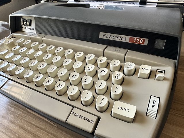
- Pete E.
- Typewriter Talk Elite
Offline

- From: Idaho - USA
- Registered: 23-6-2020
- Posts: 2,696
Re: Smith Corona SCM Series 6 Electra 120 in Cursive. Thanks Pete!
Jim,
Glad you got a good Cursive...and I am sort of glad it did not turn out to be an Italics machine.
I got a 1-colour ribbon from Ribbons Unlimited...in a blue-purple colour (nylon fabric, though).
On ivory coloured paper, the blue/purple can look like a letter is hand written.
Enjoy your Electra 120 !
- robmck
- Speed Champion
Offline
- From: Seattle, WA
- Registered: 31-1-2022
- Posts: 398
Re: Smith Corona SCM Series 6 Electra 120 in Cursive. Thanks Pete!
Wow! Congratulations, Jim, and great work Pete!
I've got a machine with Artistic Script like this one. Using it puts a smile on my face every time.
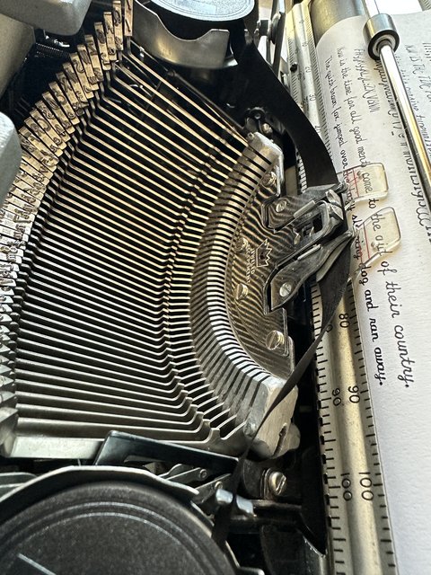
I notice in the photos that the top of the caps look a little light. Have you done a motion adjustment on it? Seems like the segment could come a touch lower relative to the platen. Or maybe it's just a tired ribbon.
- Kalani
- Touch Typist
Offline
- From: Fountain Pen Network profile
- Registered: 26-8-2021
- Posts: 169
Re: Smith Corona SCM Series 6 Electra 120 in Cursive. Thanks Pete!
robmck wrote:
Wow! Congratulations, Jim, and great work Pete!
I've got a machine with Artistic Script like this one. Using it puts a smile on my face every time.
I notice in the photos that the top of the caps look a little light. Have you done a motion adjustment on it? Seems like the segment could come a touch lower relative to the platen. Or maybe it's just a tired ribbon.
"Motion Adjustment"?
Is that in the SCM series 6 electric manual?
I did notice that, also DW. Not sure how to adjust that.
Tips?
- •
- fountainpensplus
- Touch Typist
Offline
- From: Eugene, OR, USA
- Registered: 11-10-2021
- Posts: 153
Re: Smith Corona SCM Series 6 Electra 120 in Cursive. Thanks Pete!
Jim,
Congratulations! A good cursive/script machine amazes me when each character looks tied together. Enjoy some mechanical handwriting.
George
- robmck
- Speed Champion
Offline
- From: Seattle, WA
- Registered: 31-1-2022
- Posts: 398
Re: Smith Corona SCM Series 6 Electra 120 in Cursive. Thanks Pete!
I notice in the photos that the top of the caps look a little light. Have you done a motion adjustment on it? Seems like the segment could come a touch lower relative to the platen. Or maybe it's just a tired ribbon.
"Motion Adjustment"?
Is that in the SCM series 6 electric manual?
I did notice that, also DW. Not sure how to adjust that.
Tips?
Adjustments for "shift", "motion", and "on-foot" all go together. I think technically, you're needing to do an "on-foot" adjustment to get the capital impressions even, then "motion" adjustment to align the lowercase with the new position of the upper-case.
The whole thing is about getting the point that the letter strikes the platen to be perfectly centered vertically so you get a good impression on the top and bottom of the letter. For typefaces like Artistic Script, which are very tall from the lowest descender of the lowercase to the highest capital, it's even more to get this right.
Generally, typewriters have a set screw (or two) that sets the position of the segment relative to the carriage for when the typewriter is resting in the lowercase setting, and another set screw (or two) for where it lands when you press shift.
Looking at Ted Munk's Smith Corona 5 and 6 Series Typewriter Repair Shop Manual, the "Model 6LT Shift Adjustments" section begins on page 5. It looks like these have a single screw for uppercase and another for lowercase:
Looks like you want to adjust screw 7 to set the capitals ("on-foot"), and screw 20 for the lowercase ("motion").
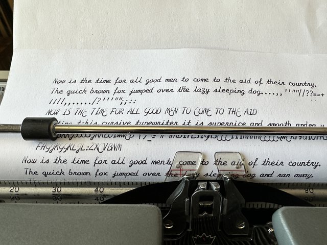
To adjust the capitals, it's common to type a few capital H's and then look at the top and bottom serifs to see which is heavier (H is a handy character because it's vertically symmetrical). Then, you adjust the captials screw until it's even on top and bottom. Next type a pattern of HhHhHh to adjust the lowercase to match the new H position. This pattern is handy because h should exactly match H at the top and bottom, and the serifs of each align nicely.
But, for Artistic Script, it's a little tricker because you don't have serifs like that, and the typeface is quite tall (I have a Thai typewriter that was very tricky to find the right letters to use).
For Artistic Script, I'd use a capital Z to get started, but throw in a couple uppercase E's because they descend below the baseline in this typeface. (Similarly, on my Thai typewriter, I had to find a pair of letters that showed the highest and lowest extremes in the shifted position, then find a pair of letters in the unshifted position).
Once you get a position that Z and E work well in, you need to get the lowercase to align. That's tricky because there's no letters in the Artistic Script lowercase that have flat horizontal lines you could line up with the bottom of the Z. I think the lowercase w is the closest proxy as the two lower curves imply a line.
(If you want to get really picky, you want the curves to extend just a touch beyond the straight lines to make it overall seem perfectly lined up. This "overshoot", based on the Müller-Lyer illusion, is built into all typefaces. Typeface designer Tobias Frere-Jones has a great article on it).
Doing this adjustment can sometimes be frustrating - I sometimes get up and down confused when I am doing the last fine-tuning and make it worse, then have to back-track. Also, a few of my typewriters seem to adjust more happily if I do the lowercase first. Not sure why. In either case, I find it works best to work slowly in 1/8 of a turn increments, a bit like adjusting a carburetor mixture.
For some of my typewriters, getting this exactly right makes a huge improvement on the look of the impression.
Hope that helps.
- robmck
- Speed Champion
Offline
- From: Seattle, WA
- Registered: 31-1-2022
- Posts: 398
Re: Smith Corona SCM Series 6 Electra 120 in Cursive. Thanks Pete!
Ooops forgot a little bit at the end: If you get to a point where a pattern of ZEZwZfZgZ looks to have even weight on top and bottom of the letters (the top and bottom strokes have the same thickness), and everything lines up, you should be done. This pattern is a little unusual, most typefaces, you can get away with HhHhHgH, but I think this pattern is good for this cursive.
Other cursives like the Script #69 on my Olympia SF, I've gotten away with the standard patterns.
Now if I can ever get my hands on a blackletter typewriter someday...
- robmck
- Speed Champion
Offline
- From: Seattle, WA
- Registered: 31-1-2022
- Posts: 398
Re: Smith Corona SCM Series 6 Electra 120 in Cursive. Thanks Pete!
Oops: the page reference to Ted Munk's typewriter bible should be 53, not 5.
- Pete E.
- Typewriter Talk Elite
Offline
- From: Idaho - USA
- Registered: 23-6-2020
- Posts: 2,696
Re: Smith Corona SCM Series 6 Electra 120 in Cursive. Thanks Pete!
Kalani,
Couple of photos of my cursive Electra 120...to give you some ball-park idea about the number of visible screw threads above the locking nuts.
Of course, each machine will have its own sweet-spots.
.

- Kalani
- Touch Typist
Offline
- From: Fountain Pen Network profile
- Registered: 26-8-2021
- Posts: 169
Re: Smith Corona SCM Series 6 Electra 120 in Cursive. Thanks Pete!
Huge thanks to pete and rob mck.
After your detailed pictures and terrific explanation (far better than the printed manual!) , it was an easy quick fix.
Thanks again,
jimmy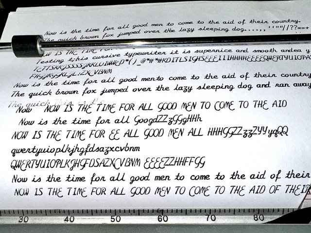
- •
1 2 Jump to
