

- Pete E.
- Typewriter Talk Elite
 Offline
- From: Idaho - USA
- Registered: 23-6-2020
- Posts: 2,701
Re: Skyriter....This Week...
The garage photos, yesterday, were a bit washed-out.
Here are a couple more that captures the true colours a bit more accurately.
.
.
- mikeytap
- Speed Champion
Offline

- From: Georgia, USA
- Registered: 25-12-2021
- Posts: 368
Re: Skyriter....This Week...
![]() Nice addition to your collection, though your cat looks unimpressed.
Nice addition to your collection, though your cat looks unimpressed.
- Be kind
- Pete E.
- Typewriter Talk Elite
Offline
- From: Idaho - USA
- Registered: 23-6-2020
- Posts: 2,701
Re: Skyriter....This Week...
Mike,
Usually "Lily" is right there when a new machine shows up. But I think the new-paint smell of the metal lid cover might be off-putting.
.
.
- •
- mikeytap
- Speed Champion
Offline
- From: Georgia, USA
- Registered: 25-12-2021
- Posts: 368
Re: Skyriter....This Week...
I miss having a cat. They bring down your blood pressure. Only current one is a feral that we leave food out for. Would get another but our border collie might object.
Our last cat liked to write zzzzzzzzzzzzzzzzzzzzzzzzzzzzzz on my computer keyboard.
- Be kind
- Pete E.
- Typewriter Talk Elite
Offline
- From: Idaho - USA
- Registered: 23-6-2020
- Posts: 2,701
Re: Skyriter....This Week...
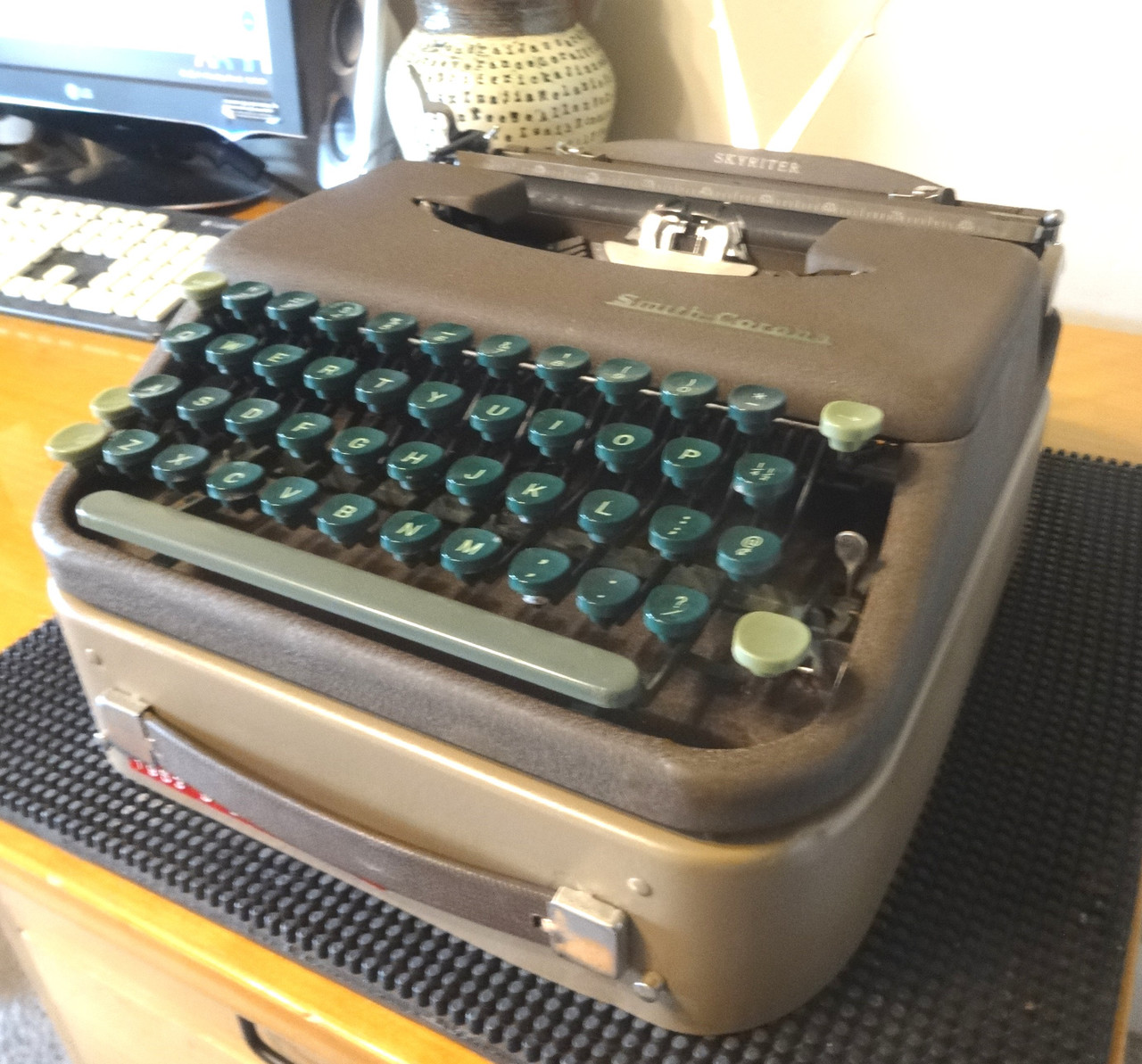
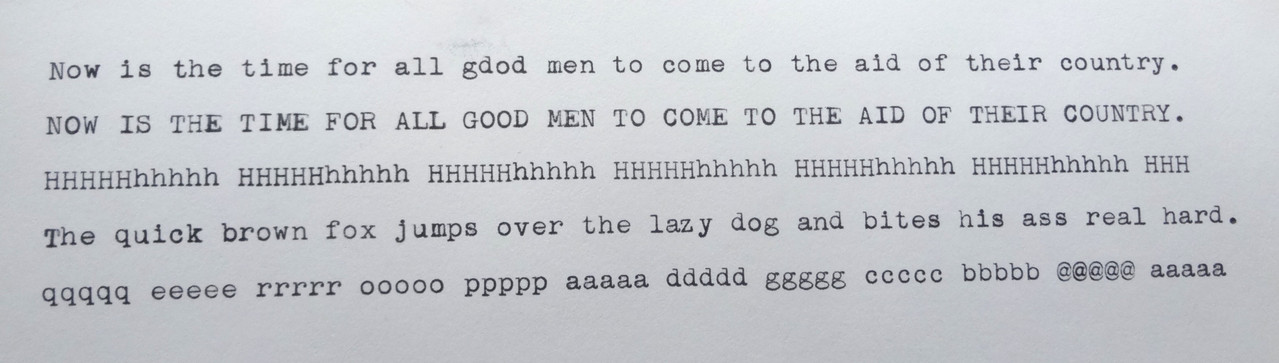
Typing sample with a new black nylon ribbon in place.
Looks like the HHHHHhhhhh alignment needs a wee bit of an adjustment.
The lower case typeslubs were so filled with ribbon gunk, the small-circles making up some of the lower case letters were just a dark-black smudge on paper.
Took lacquer thinner and a nylon tooth-brush to get them clean.
.
- •
- Pete E.
- Typewriter Talk Elite
Offline
- From: Idaho - USA
- Registered: 23-6-2020
- Posts: 2,701
Re: Skyriter....This Week...
Here is Duane Jensen's YouTube video on how to adjust the type alignment on the early S-C Skyriters :
- •
- Eagle
- Platen Punisher
Offline

- From: Frankfurt am Main - Germany
- Registered: 16-4-2024
- Posts: 58
Re: Skyriter....This Week...
The 'z' seems to be a bit off. This could be a one time occurrence during typing or the norm of a tilted slug.
For a short period of time (around 1980) I was deployed to the type alignment division in our company. Some of the then applied procedures are still in my memory. As we all know the alignment of a type slug and it's typebar is not an easy task for an inexperienced mechanic. There is a high risk of making matters worse while trying to fix them.
But at first you can do another typing test. The lower and upper case letters 'Hh' can be used or alternative 'Mm'. It's a personal choice. I usually prefer 'Mm' because of the M's 3 lower points. The used letter generally depends also on the typewriter's individual typeface.
General procedure of type alignment:
At first the base alignment of upper case 'H' or an other useful wide span character such as '/' with it's typebar hand moved and gently pressed against the platen (without paper) should be backlight checked and adjusted. Then the upper / lower case alignment should be done and then if needed the individual type slug corrections.
Beside the upper / lower case comparison a type alignment test could involve all upper case characters against 'H' and all lower case characters against 'h':
A typing test could look like this (on my German computer keyboard layout):
HQHWHEHRHTHZHUHIHOHPHAHSHDHFHGHJHKHLH ...
hqhwhehrhthzhuhihohphahshdhfhghjhkhlh ...
To test the 'z' only: HZHZHZHZHZ ... hzhzhzhzhzh ...
I hope my remarks were easy enough to follow and that I didn't spend too much time on information you were already aware of. ![]()
- Eagle
- Platen Punisher
Offline
- From: Frankfurt am Main - Germany
- Registered: 16-4-2024
- Posts: 58
Re: Skyriter....This Week...
Eagle wrote:
General procedure of type alignment:
At first the base alignment of upper case 'H' or an other useful wide span character such as '/' with it's typebar hand moved and gently pressed against the platen (without paper) should be backlight checked and adjusted.
The proposed use of the '/' might be a little confusing because it’s lower case on an American keyboard. On German keyboards it is an upper case character.
On American typewriter keyboards an upper case 'I' or 'L' can be used instead.
- Pete E.
- Typewriter Talk Elite
Offline
- From: Idaho - USA
- Registered: 23-6-2020
- Posts: 2,701
Re: Skyriter....This Week...
Eagle, thanks so much for your informative postings.
I will have this Skywriter back on my work bench today and will consider some of your suggestions.
Side-to-side alignment problems do not seem to bother me much. Up & down alignment issues do though.
I stay away from any attempts to bend type-bars. As you said, best left for professionals who would have the proper set of tools and training.
.
- •
- Pete E.
- Typewriter Talk Elite
Offline
- From: Idaho - USA
- Registered: 23-6-2020
- Posts: 2,701
Re: Skyriter....This Week...
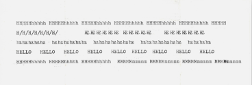
New print sample after this morning's work on the Skyriter...
.
.
- •
