- Stevetype33
- Touch Typist
 Offline
- From: UK
- Registered: 16-3-2013
- Posts: 172
Ugliest typewriter
It's subjective, and some machines are 'bulldog' ugly/cute, but my vote for the worst is the Empire Aristocrat, its olive-green matt finish seems to suck the life out of everything around it.
- Shangas
- Speed Champion
 Offline
 - From: Melbourne, Australia
- Registered: 17-3-2013
- Posts: 298
Re: Ugliest typewriter
The E-A is pretty ugly. I love the *shape*, but the colour does absolutely nothing for me. And I'm not really a green person, to begin with.
I know some people swear by the Olivetti 32 Lettera, but that one also looks rather bland.
"Not Yet Published" - My History Blog
"I just sit at a typewriter and curse a bit" - Sir Pelham Grenville "P.G." Wodehouse
"The biggest obstacle to professional writing is the necessity for changing a typewriter ribbon" - Robert Benchley
- Uwe
- Moderator
 Offline
- From: Toronto, Canada
- Registered: 12-3-2013
- Posts: 4,410
Re: Ugliest typewriter
The high-water mark for typewriter design, in my very subjective opinion, was sometime in the mid-'60s. The machines leading up to that point in time were for the most part were visually seductive and functionally practical.
Toward the end of the manual era plastic replaced metal body work and chromed trim, smooth and sexy curves became angular protrusions, and the mechanisms themselves took on a built-to-a-price feel.
I recently picked up a Smith-Corona Corsair Pride Line and was quite disappointed with it. I have no idea when it was built (the Database doesn't list its serial number), but it has to be from the late '60s or early '70s. I found it to be very disappointing in every aspect and has to be the worst Smith-Corona I own by a long shot.
So to pick the ugliest typewriter, I would probably look to the swan song years of the manual machines for a champion.
A perfect example of what I'm talking about is the Hermes 3000. The original model, which I think was introduced in 1958, is an intriguing typer with a distinctive case and wonderful lines. Its design was updated in 1966 (I think) with a case that looks to have been beaten with an ugly stick for hours on end.
I appreciate these designs are reflections of their time, so maybe the late '60s was just a bad period for industrial design overall, but this Hermes is not one that will ever end up on my shelf:
The Schreibmaschinen website has a nice page that shows the evolution of the Hermes 3000.
The pronoun I has always been capitalized in the English language for more than 700 years.
- Shangas
- Speed Champion
 Offline
 - From: Melbourne, Australia
- Registered: 17-3-2013
- Posts: 298
Re: Ugliest typewriter
The 1950s Hermes is very sleek and 'futuristic', for want of a better term. I'd be proud to own such a machine.
The third-generation Hermes 3000 was made in 1971. The 1970s was a disaster in so many ways. Fasion, clothing, cars, design, style, music, movies...need I say more? It's hardly a surprise.
"Not Yet Published" - My History Blog
"I just sit at a typewriter and curse a bit" - Sir Pelham Grenville "P.G." Wodehouse
"The biggest obstacle to professional writing is the necessity for changing a typewriter ribbon" - Robert Benchley
- Valiant
- Touch Typist
 Offline
- From: Toronto
- Registered: 12-3-2013
- Posts: 153
Re: Ugliest typewriter
Hi. This topic raises the issue of typewriter aesthetics in general. If we make selections for the most ''ugly", which typers make the list for most "beautiful"? I take Uwe's comment "I appreciate these designs are reflections of their time" to heart. I love the lines of the original Hermes 3000, but I also love the squared 'boxy' look of the 70s model -- it is a product of it's time. Industrial design is tricky as it has to incorporate functionality. Which typers perform best from a functional aspect? We hear a lot about 'intuitive' use of websites and software. Which typers are easiest to use intuitively? Does user intuition change over time? ie. would a typist in the 20s have a different intuitive response to a machine than we do today?
Last edited by Valiant (17-3-2013 21:26:17)
"Now is the time for all good men to come to the aid of the typewriter."
- Stevetype33
- Touch Typist
 Offline
- From: UK
- Registered: 16-3-2013
- Posts: 172
Re: Ugliest typewriter
I also like some of the 'boxy' 1970s machines. I'm the proud owner of an Olympia Traveller Deluxe. I can't put my finger on it, but as soon as I saw one it went on my 'must have' list.
(Why does 'white' always strike me as 70s colour? Perhaps the white unisex jumpsuits of various 70s SciFi shows)
- •
- Valiant
- Touch Typist
 Offline
- From: Toronto
- Registered: 12-3-2013
- Posts: 153
Re: Ugliest typewriter
Yes, I think we have to rule out 'boxy' as part of any ugliness quotient. Consider the Olivetti line, which play on the lines of a modified box, for great aesthetic effect.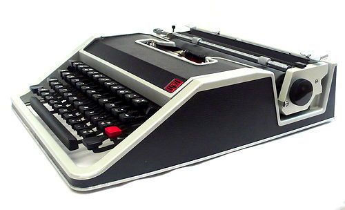
"Now is the time for all good men to come to the aid of the typewriter."
- Uwe
- Moderator
 Offline
- From: Toronto, Canada
- Registered: 12-3-2013
- Posts: 4,410
Re: Ugliest typewriter
My apologies in advance to anyone who might be unfortunate enough to own one of these, but this has to a candidate for the Top Ten list of Ugliest Typers ever designed and built.
Simply stated, the Royal Fleetwood is painful to look at. If its tissue paper box design wasn't already bad enough, someone got the not-so-bright idea to degrade its aesthetics even further by covering it in a faux wood finish. It looks crude. It looks rude. And it should receive a world-wide ban from public appearances.
I noticed today that one of these gems is being auctioned off in my area, and I took the opportunity to scrutinize the Fleetwood one more time. After a few minutes I reached an interesting conclusion: this typer is so ugly that I might just have to buy it.
The pronoun I has always been capitalized in the English language for more than 700 years.
- Amelia
- Platen Punisher
 Offline
- From: Southern California, USA
- Registered: 28-3-2013
- Posts: 94
Re: Ugliest typewriter
I simply can't stand the more "modern" types...they look like ugly plastic behemoths...![]()
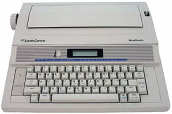
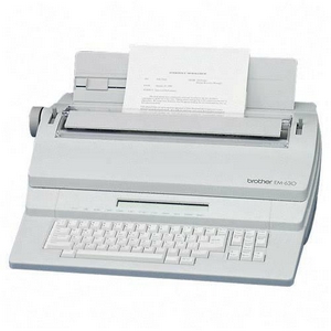
- Amelia
- Platen Punisher
 Offline
- From: Southern California, USA
- Registered: 28-3-2013
- Posts: 94
Re: Ugliest typewriter
But I do find the clear cabinet Swintec (for inmates) kinda neat (WAY too expensive though).

 1
1 
